


The best paint colors for small apartments can make a cramped room feel open—or make it feel like the walls moved closer overnight. We’ve seen one wrong undertone turn a bright-looking white gray and cold by 3 p.m.
Don’t chase the palest chip. Your window direction, ceiling height, wall condition, and flooring decide what actually works. Low contrast and the right finish matter just as much as color.
Pick paint that lets the whole apartment breathe.
How to Choose the Right Color Before You Open a Paint Can
Most people start with a fan deck and a favorite white. That’s usually backwards. If your real goal is picking a wall color to make a room look bigger, you need to read the apartment first, then the color.
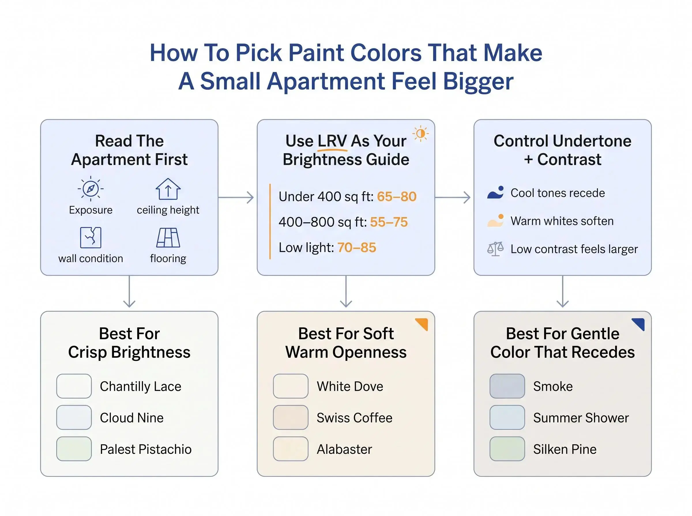
Start with LRV, or Light Reflectance Value. It runs from 0 to 100. Higher numbers reflect more light back into the room. For small apartments, colors above 70 often do the heavy lifting. But plenty of good apartment neutrals sit around 55 to 75 and still work well if the exposure is right and the room already gets a lot of sun.
A few practical targets help:
- Under 400 square feet: LRV 65 to 80 usually gives you the most breathing room
- Around 400 to 800 square feet: LRV 55 to 75 often feels balanced
- North-facing rooms: usually better at 60 to 75
- South-facing rooms: often calmer at 50 to 65 so they don’t flare up
- Basements or very low-light rooms: often need 70 to 85
Brightness matters, but undertone can make or break the result. A high-LRV white can still feel bad if it fights the light in the room. Cool blues and blue-grays tend to recede. Warm whites and creamy neutrals feel more inviting, but if they get too rich, they start moving toward you instead of away from you.
Low contrast usually wins in apartments. When walls, trim, and ceiling stay close in color, the eye keeps moving. Sharp jumps chop up the room.
Finish matters too:
- Matte hides patched walls and old surface texture
- Eggshell is a good middle ground in most living spaces
- Satin can help bounce light in dim rooms
- Higher sheen brightens, but it also tells on your prep work fast
Paint isn’t magic. But the right color, in the right finish, on properly prepped walls, can calm a room down and make it feel less boxed in. That’s where this list is headed: crisp whites, warm whites, soft neutrals, and a few pale colors that make a room look bigger and brighter without turning the whole place into a blank white shell.
1. Chantilly Lace OC-65
If you want pure brightness, this is the sharpest tool in the box. Chantilly Lace has an LRV of 92.2, which puts it near the top for reflectivity.
It reads as a true white with a slight cool edge and very little yellow, pink, or cream. In a cramped apartment, that can be a gift. It throws light back into the room, clears visual clutter, and lets cabinets, furniture, and art do the talking.
Use it where crispness helps:
- Bright apartments
- Kitchens
- Bathrooms
- Trim and doors
- Home offices
We’d be careful with it in north-facing rooms. Cool daylight can push it a little sterile. A white this bright doesn’t forgive weak light.
If you already have warm wood floors, Chantilly Lace can work especially well because the floor brings the warmth and the walls stay clean. If you want softness instead of sharpness, White Dove, Swiss Coffee, and Alabaster are easier to live with.
2. Smoke 2122-40
Blue has a quiet trick in small spaces. It recedes. Smoke proves the point without feeling childish or obvious.
This light blue works especially well on ceilings. In a small apartment, that matters more than people think. A pale blue overhead can pull the eye up, take weight off a low ceiling, and add depth without darkening the room. White ceilings are safe. They’re not always the smartest move.
Smoke also works in bedrooms and bathrooms where a little softness goes a long way. Small rooms get tense fast when every surface is stark.
A few pairings help it land:
- Crisp white trim keeps it fresh
- Natural wood stops it from feeling cold
If you’re choosing between this and Summer Shower, Smoke is cleaner and more classic. Summer Shower is grayer and more muted on full walls. For readers looking for light paint colors for small rooms that don’t feel severe, Smoke is a strong option.
3. Swiss Coffee OC-45
Swiss Coffee is one of the better answers for people searching for the best white paint for apartments and already knowing they don’t want a blue white. Fair enough. Not every apartment wants crisp.
Its LRV is 81.91, so it still reflects plenty of light, but it reads warmer and more grounded than Chantilly Lace. You’ll see a creamy white with soft yellow-beige and just enough green influence to keep the warmth from turning syrupy.
It works well when:
- Natural light is limited
- The room relies on lamps at night
- Floors and furniture already lean warm
- One paint color needs to carry most of the apartment
This color does a nice job in living rooms, bedrooms, and open layouts where a colder white can flatten out by the second afternoon. Put it next to Chantilly Lace and Swiss Coffee will look noticeably creamier. That’s not a flaw. It’s the point.
4. Acadia White OC-38
Some apartments need a middle ground. Not stark. Not beige. Just warm enough to feel human. Acadia White sits in that lane.
Its LRV is 66, so it’s still bright, but it has more body than the higher-reflectance whites. The undertone leans warm red, which gives it a different feel from the more neutral whites on this list. It can make kitchens, hallways, bathrooms, and living areas feel more settled without going heavy.
This is a good color for readers who keep rejecting samples for opposite reasons. Pure whites feel cold. Creams feel too yellow.
Acadia White also fits clean interior styles well, including Scandinavian and minimalist spaces, because it has warmth without looking muddy. Still, we’d sample it carefully in south-facing rooms. Afternoon sun can make a warm white act louder than you expected.
Compared with Swiss Coffee:
- Swiss Coffee is brighter and creamier
- Acadia White has more body and a redder warmth
5. White Chocolate OC-127
The name sounds richer than the actual paint. On the wall, White Chocolate reads as a clean white with warm sunny undertones, and that makes it useful in dim apartments.
This is the kind of color that helps in window-poor rooms, interior hallways, and those city apartments where the “view” is mostly another building. A cold white in those spaces can look drained. White Chocolate gives you light without that clinical feel.
It helps because the undertone does real work:
- It takes the edge off weak light
- It makes low-light rooms feel less flat
- It feels warmer without going fully creamy
If you’re comparing warmer whites, here’s the split: Swiss Coffee is creamier and flexible across more rooms, Acadia White has more visible warmth and body, and White Chocolate is the one to look at when the room needs brightness plus a sunny lift.
The best white paint for apartments is never just “the most popular white.” Exposure decides a lot of this.
6. Silken Pine 2144-50
Pale green is underrated in small apartments. Silken Pine proves you can add personality without shrinking the room.
With an LRV of 74.02, it stays on the light side. It reads as a warm green, calm and understated, closer to a near-neutral than a true color statement. That’s why it works in bedrooms, kitchens, and transition spaces that need softness more than drama.
It does a few things well:
- Keeps alcoves and corners airy
- Softens hard architectural lines
- Brings in color without much weight
Awkward corners tell the truth about paint. Silken Pine often helps those forgotten spots feel intentional instead of dim.
Compared with Palest Pistachio, Silken Pine is warmer and deeper. Still, test it in hallways and shadowy corners. Green shifts with flooring, cabinetry, and daylight faster than people expect.
7. Summer Shower 2135-60
Summer Shower gives you the receding effect of blue without shouting “blue room.” That alone earns it a spot here.
Its LRV is 69.43, just under the 70 mark, but still solid for a small apartment. It reads as a light blue-gray with a watery cyan cast and low saturation. That low saturation matters. In a small room, loud color stops the eye. Quiet color keeps it moving.
It fits especially well in:
- Bathrooms
- Bedrooms
- Sunlit home offices
This color shifts through the day. Cooler daylight pulls out more blue. Warm bulbs bring forward the gray. That flexibility can be good, but it means sample first.
It pairs well with clean white trim, pale oak, brushed nickel, and linen. Compared with Smoke, Summer Shower is softer and grayer on the wall, while Smoke feels a little cleaner and stronger overhead.
8. Raleigh Peach CW-205
Not every apartment opens up by going cooler. Some spaces feel bigger once they stop feeling cold.
Raleigh Peach has an LRV of 62.65, so it still reflects a fair amount of light, but it carries more visible color than the palest options. It’s a warm peach that glows softly and makes a room feel welcoming instead of washed out.
This is better for comfort than maximum expansion. That distinction matters.
It can work well in dim rooms that look lifeless under gray or stark white. It also makes sense in small hallways, modest living areas, and bathrooms where you want a softer, spa-like feel instead of something clinical. If you hate cold whites, this is one to test.
Compared with Hint of Pink, Raleigh Peach is warmer and easier to notice. Use it where emotional warmth matters as much as square footage.
9. Cloud Nine 2144-60
Cloud Nine is one of the best neutral alternatives to white if you want brightness without the sterile finish.
Its LRV is 83.62, so it reflects a lot of light. On the wall, it reads as a very light beige with neutral undertones. That neutral balance makes it easier to live with across changing daylight, which is useful in studios and open layouts where one color has to connect several zones.
This one earns its keep by staying out of trouble. No obvious pink. No strong cream. No hard gray cast.
For small-room strategy, keep the ceiling slightly lighter or stay within the same color family overhead. Either move can help walls look taller without breaking continuity. Compared with White Dove, Cloud Nine leans more beige-neutral, while White Dove reads warmer and more traditionally white.
10. Hint of Pink 884
This is one of those colors people fight at the swatch and like on the wall. Hint of Pink is very light, warm, and reflective, with an LRV around 83.
It doesn’t usually read “pink room.” It reads softer than flat white. In apartments with cold light, that can make a huge difference.
It works because:
- It reflects a lot of light
- It warms cool daylight without turning yellow
- It softens a room in a way plain white sometimes can’t
Bedrooms, nurseries, dressing spaces, and chilly living rooms are the best candidates. Compared with Raleigh Peach, it’s lighter and more restrained. Compared with Swiss Coffee, it trades creamy warmth for a subtle blush cast. If you want colors that make a room look bigger and brighter but still feel personal, this is a smart choice.
11. Palest Pistachio 2122-60
Palest Pistachio is almost white, but not boring. That’s the appeal.
Its LRV is about 85.2, making it one of the most reflective colors here. It reads as a cool, pale pistachio that sits much closer to the white family than a typical green. In compact kitchens, small offices, and tight living areas, that slight green note can freshen the room without loading it up with color.
Why it works:
- High reflectance keeps things bright
- The cool cast helps walls recede
- It adds character without much saturation
Compared with Silken Pine, it’s lighter and cooler. Compared with Cloud Nine, it feels fresher and less beige. For readers who want more than white but less commitment than a pastel room, this is a very safe edge to stand on.
12. White Dove OC-17
White Dove is one of the safest answers on this list, and sometimes safe is exactly right. When someone asks us for a dependable apartment white, this is usually in the conversation.
Its LRV sits around 83 to 83.16. That gives you high reflectance without the icy feel of a sharper white. It reads warm but close to neutral, soft enough to feel welcoming and not obviously yellow.
It works especially well in:
- Living rooms
- Bedrooms
- Hallways
- Older apartments with imperfect walls
That last point matters. In matte, White Dove can soften patching and wall texture instead of spotlighting every flaw. Compared with Chantilly Lace, it’s softer and easier. Compared with Swiss Coffee, it’s less creamy and a bit more neutral. If you feel overwhelmed, White Dove is a good place to start.
13. Alabaster
Alabaster is a dependable warm white for people who want openness without starkness. It has an LRV of 82, so it still reflects strong light in compact rooms.
It feels cozy and welcoming, not harsh. That makes it useful across multiple rooms, especially in open-plan apartments where one wrong white can throw the whole place off. It brightens bathrooms without turning cold, helps kitchens stay fresh, and makes living rooms feel more connected.
Compared with White Dove, Alabaster can read a touch creamier. Compared with Chantilly Lace, it clearly favors comfort over crisp brightness.
If your furniture may change over time, Alabaster is flexible. Dark wood, pale modern pieces, older trim, newer cabinets, it can usually hold the room together without making itself the main event.
What Actually Makes Small Apartments Look Bigger After the Paint Dries
A good color chip is only part of the job. The apartment feels bigger when the whole visual system works together.
Keep trim, walls, and often the ceiling close in color. The closer they are in lightness, the less the room gets chopped up. A ceiling one shade lighter can help with height. Painting everything in one continuous tone can also work, especially in tight rooms with awkward lines.
A few practical rules help more than any trend list:
- High-contrast trim often makes a small room feel busier
- Eggshell is usually the best balance of softness and cleanability
- Matte is better on older walls with patches and texture
- Satin helps in dim spaces only if the prep work is solid
- Layered lighting cuts down shadowy corners that shrink a room fast
Watch your bulbs too. Very warm bulbs can make creamy paint go too yellow.
Flooring matters more than people expect. In a compact apartment, wall color and floor tone are always in conversation. If you’re updating both, aligning undertones can make the space feel wider and more intentional. We handle interior painting, wood flooring installation, and wood floor sanding and staining, and that coordination is usually where the bigger visual change happens. For anyone searching queens apartment paint ideas, the rules are the same: tight layouts, mixed light, low ceilings, older surfaces. Undertone and finish decide a lot.
Common Small-Apartment Paint Mistakes to Avoid
Most paint mistakes happen before the roller hits the wall. They’re decision mistakes.
Here are the ones we see most often:
- Choosing from a tiny swatch under store lighting instead of testing it morning, afternoon, and evening at home
- Assuming the brightest white is the best wall color to make a room look bigger
- Using warm off-whites in north-facing rooms without checking how muddy they get
- Picking colors that are simply too dark for the room’s exposure
- Breaking the room apart with strong contrast between walls, trim, ceiling, and cabinets
- Forgetting sheen until the wall starts showing every seam and patch
- Ignoring fixed finishes like wood floors, tile, countertops, and stone
- Repainting only the walls when the room really needs a more unified update
Small kitchens and bathrooms are where this gets obvious. Paint helps, but if the cabinets, floor, light, and layout are fighting each other, color alone won’t rescue the room. In spaces already due for bigger work, that’s often the right time to rethink everything together. For larger updates, we also handle kitchen renovation in Queens and bathroom remodeling in Brooklyn and Manhattan.
Conclusion
The colors that make a room look bigger and brighter usually win for the same reasons. They reflect light well, keep undertones under control, and avoid hard visual breaks across the room.
The best paint colors for small apartments are not automatically the lightest ones. They’re the ones that fit the room’s exposure, ceiling height, wall condition, and flooring. A brilliant white in the wrong room can feel flatter than a softer neutral that actually works with the light.
Narrow your list to three colors. Sample them on more than one wall. Watch them through the full day. Paint changes faster than people expect.
If your apartment also needs wall prep, interior painting, or flooring work, coordinate those decisions together. When the surfaces, undertones, and finish all line up, the room usually feels larger than paint alone could ever make it.